An executive of a large automotive company tells the story of two engineers who were arguing about the correct angle of an engine mount. The two had been at it for more than half an hour — one engineer swearing that the angle was 40 degrees while the other fumed that it was 50 degrees. After several civil attempts to correct each other’s viewpoint, they had just started attacking each other’s intelligence, ability, and character when the executive happened to walk by.
“What axis of reference are you using?” he asked.
“The vertical, of course!” exclaimed one engineer.
“The horizontal!” said the other.
Both stopped in amazement as they realized they had been saying the same thing! Because they had not established a common frame of reference for their discussion, each had assumed the other’s viewpoint was wrong.
Individual Worlds
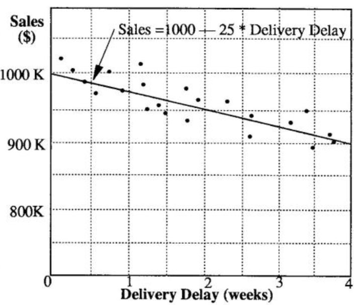
Sales vs. Delivery Delay
Scatter charts, which plot one variable’s data against another, answer the question, “What happened historically?” The view is retrospective.
The story of the two engineers points out an age-old communication problem. Each of us carries our own set of assumptions about reality — our own individual picture of the world. Oftentimes, we mistakenly assume that that our viewpoint is the only way of looking at a situation. Both engineers, for example, believed that the other person’s position was based on the same axis as their own — they never even questioned it. If we don’t acknowledge our assumptions at the outset of a discussion, we risk experiencing the same frustrations as the two engineers.
In many instances, spoken language can be a hindrance rather than a help in communicating our mental pictures of reality because words, unlike pictures, do not force us to be explicit when explaining our reasoning. Graphics, because they can represent ideas more clearly, can be a much more powerful and effective means of communication (see “Systems Thinking as a Language,” Viewpoint, April 1991). Trite as it may sound, the saying “a picture is worth a thousand words” still holds true. Had the two engineers simply drawn two axes and a line, they would have saved a great many angry words. When the issue is more complex than a single angle, the use of graphics can become even more important for reaching a shared understanding.
Using Graphical Function Diagrams (GFD), it is much easier to capture how two variables relate in a format that is concise and invites others to share their own perspectives. Graphical functions can help us go beyond merely observing correlational relationships (when X happens, Y happens) to exploring our understanding of the causal connection between two variables (X causes Y). In constructing GFD’s one should follow the 60% rule — it’s better to get it 60% right very quickly and spend time modifying it than spend a great deal of effort trying to get it 100% right the first time.
Graphical Functions vs. Scatter Charts
Graphical functions are best described by first establishing what they are not. Although they may look similar, graphical functions are not the same as scatter charts, which plot one variable’s data against another’s. If we were to look at the relationship between sales and delivery delay using a scatter chart, we would plot some data points and then draw a regression line through them (see “Sales vs. Delivery Delay”).
From the scatter chart, we can see that in weeks one through four sales fall by $25K for each one-week delay. We can then extrapolate beyond the historical data to predict that a five week delay will result in an additional $25K drop in sales. In general, scatter diagrams answer the question “What happened historically, was there a correlation, and based on that information what can I expect to happen in the future?” They tend to be retrospective.
A graphical function, on the other hand, is very much prospective in nature. By including the full spectrum of possible values, GFD’s can help you see beyond the historical range of operating values and ask, “Given my understanding of the system, what do I think will happen at each possible point?”
Creating a GFD
A Graphical Function can help explicate your (or a team’s) mental model of the relationship between two critical variables. Unlike behavior charts, GFDs do not show how variables change over time, but how two variables interrelate. To create a GFD, it is best to begin by answering the following questions:
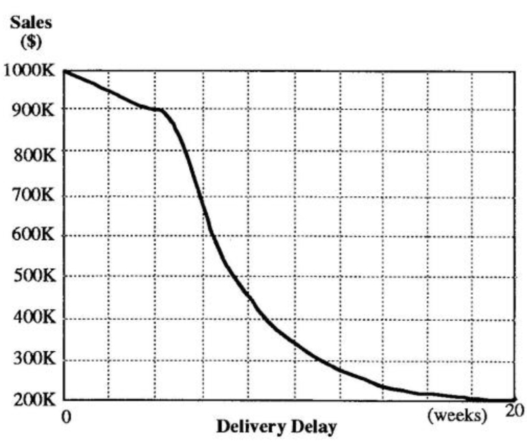
Delivery Delay Graphical Function Diagram
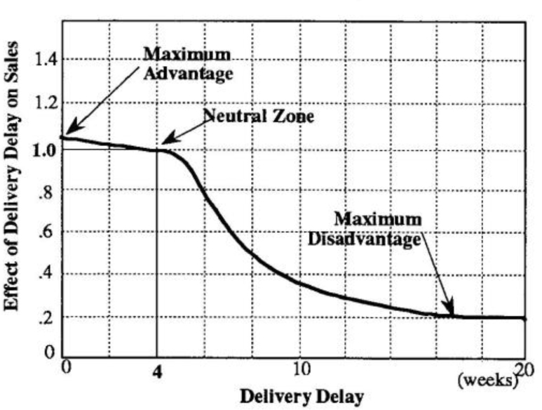
Effect of Delivery Delay on Sales
- What do we know from the outset about the causal relationship between these two variables?
- Arc there any “neutral zones” where the variable on the y axis is not affected by changes in the x variable?
- What are the extreme values that both variables can assume?
If we looked again at the sales and delivery delay example using a graphical function diagram, we would start by asking what we think the general nature of the relationship is between the two variables — is it flat, is it upward sloping, or is it downward sloping? With most products, longer delivery delays mean lower sales, so we can assume that the relationship would slope downward.
Using available historical data and past experience we can then take a first cut at identifying a neutral zone where sales may be insensitive to differences in the length of the delay (see “Delivery Delay Graphical Function Diagram”). Past experience may suggest that sales will increase steadily as the delay falls below four weeks. A sampling of customer contacts may tell us that there is not a whole lot of difference between 3.5 and 4.5 weeks. On the other hand, past market research also tells us that if the delay grows greater than five weeks, sales will fall dramatically. Looking further, we realize that even in the extreme case of a 20 week delay, S200K of sales will still come from captive customers who have nowhere else to turn — at least in the short term.
Building Shared Understanding
The resulting diagram is a concise causal hypothesis which states that customers will reward shorter delays with slightly higher orders, but will severely penalize delays that extend beyond an acceptable range. The GFD conveys a much richer description about the relationship between delivery delay and sales than a scatter chart based on historical data the diagram helps visualize the full range of implications and minimizes the danger of remaining myopically focused on a narrow band of possible outcomes. Developing the diagram as a group can also help surface differing mental assumptions about the potential impact of deteriorating or improving delivery performance (remember the engineers!).
Sometimes it is helpful to convert the relationship into a more general form where the y-variable is converted to an “effect-or variable. Instead of “Sales” on the y-axis, for example, we would have “Effect of Delivery Delay on Sales” (see graph), which shows that a 3.5 to 4.5 week delay has no effect, shortening the delay nets us a maximum gain of 5% (1.05 times the sales number we would have obtained if we were in the neutral zone), and lengthening the delay to 20 weeks can choke sales by as much as 80%.
The “Effect-of” version of the GFD focuses attention on the relative impact of the delivery delay on sales instead of on the specific numbers themselves. In this way, we can compare across different variables, such as the relative effects of quality on sales vs. marketing spending on sales, and make explicit our understanding of which factor is the dominant driver.