An old Winnie the Pooh cartoon sketch shows Christopher Robin dragging Edward the Bear down a set of stairs by one arm, while the bear’s head bumps along each step. The caption says something like, “Edward the bear knows there must be a better way to come down the stairs, if only he could stop bumping his head long enough to think about it.”
How many times have we felt the same way, bumping along as always and wondering whether there is a better way to do things? Each time we are faced with a familiar problem, we swear to ourselves that we will look deeper into the situation and really solve it once and for all. But then something else comes up, causing us to push the question to the back burner until it surfaces again.
Events, Events, Events…
We live in the world of events:, “The stock market dropped 15 points today… A five-car pileup occurred on interstate 95…Our copy machine broke down at 3 o’clock…Our first quarter earnings were down by 20%…Our latest product launch was 10 weeks late…” and on it goes. When events (like a car breakdown) have a direct impact on our lives, we have to react as quickly as possible to them. But there is no long-term leverage for creating change in an organization if we only stay at the level of events (see “Levels of Understanding: ‘Fire-fighting’ at Multiple Levels,” June/July 1993).
For example, managers at A-to-Z Corp., a semiconductor company, have been puzzling over a series of events that occurred in their most recent quarter. They posted record sales for the quarter, with the majority of the sales force meeting or exceeding sales quotas. All products scheduled for release were launched, with additional products ready for early release in the next quarter. At the same time, however, profits actually declined for the first time in company history, as overhead costs as a percent of sales reached an all-time high.
Interrelated Patterns of Behavior
The frenetic pace at A-to-Z made it easy for its employees to get caught up in the daily demands of the semiconductor business. Until their profits declined, A-to-Z’s managers had no idea that there might be underlying financial problems. To address the issue of falling profits, they decided to collect data about their past performance, looking back over a period of time to identify important patterns of behavior. What, for example, was the pattern of product launches over the last two years? Or the number of new products in the pipeline? The number of product engineers? The average experience level of engineers?
The data they found was as follows: Sales revenue had risen every quarter for the past 10 years, but profit growth had been falling for the last several quarters and had actually declined in the most recent quarter. Because the company’s past success was based on new products, there was a continued commitment to launching many new products each year. Each quarter they added new sales people to meet more aggressive sales targets.
An initial plot of these events over a period of several years is shown in “A-to-Z’s Performance OverTime.” Just plotting the data, however, provided little insight about why the trends have occurred.
Data Analysis and Theory Building
There are many tools and methods available for analyzing such time series data as the A-to-Z managers collected. The quality improvement arena, for example, offers run charts, scatter diagrams, and statistical process control methods for analyzing trends, interrelationships, and system capability. Various regression or trend analysis tools are also available for identifying correlations between variables. But there are limitations to the use of these tools.
A-TO-Z’S PERFORMANCE OVER TIME
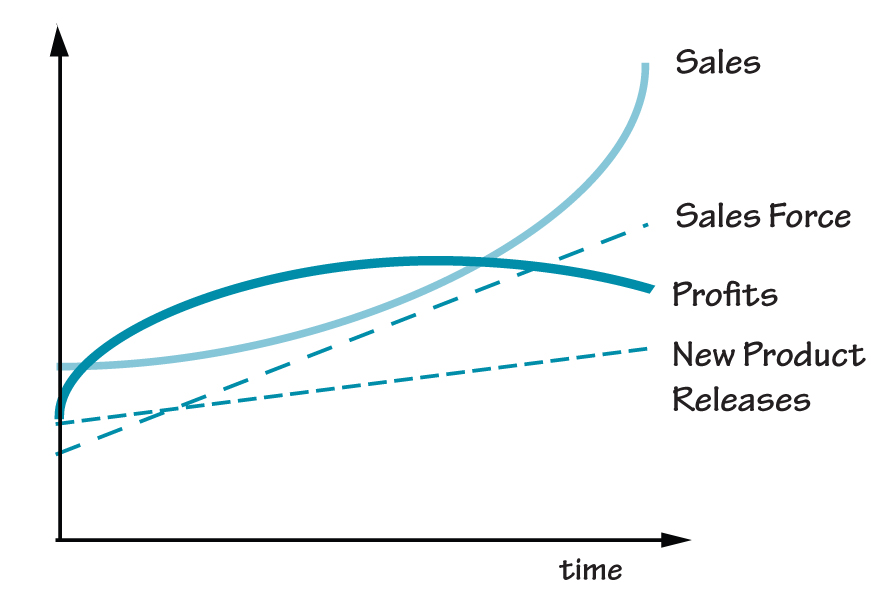
Sales revenue at A-to-Z has risen every quarter for the past 10 years, but profit growth has been falling for the last several quarters. Meanwhile, new product launches and the size of the sales staff have been increasing every year.
One obvious limitation is that regression or any other data analysis tool is useless without data. However, there is often a paucity of data available for analyzing a new problem — and therein lies the dilemma. If we are only using data analysis tools, we run the risk of just focusing on those variables for which we have data. On the other hand, it is unrealistic to try to track data for everything in advance. Data analysis tools and methods are most useful when they are used as part of a theory-building process.
Drawing behavior over time (BOT) graphs (also called “reference modes”) can help break the data availability dilemma by building causal theories before we gather the necessary data. The BOTs can be used to connect past observed behavior with future behavior in a way that offers insight into the causal structures underlying the case. Developing such causal theories reduces the risk of becoming straight-jacketed by the limitations of the data that is readily available. In short, BOTs guide the use of data, but are not data-bound.
Building a Theory
The A-to-Z managers began working with their initial behavior over time charts by putting together a cross-functional team to try to understand what was happening. This team decided to look at a time horizon of five years.
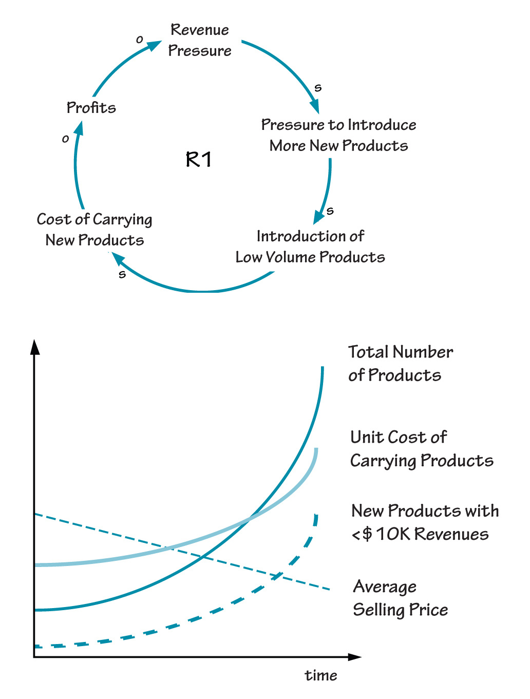
To begin to understand why profits were falling even as revenues were growing and new product introductions were running smoothly, the A-to-Z team hypothesized about the relationship between total number of new products and the unit cost of carrying products. Although the number of products in their catalogs had been growing steadily, they wondered whether the cost of carrying the products was growing at an even faster rate. One person inferred that the number of new products with revenues of less than $10K was probably increasing and that the average selling price was decreasing.
This possibility would help explain how they could have record unit sales and dollar volume and still have falling profits. Another person suggested that increasing revenue pressures might be putting pressure on new product development to keep pumping out even more new products. These pressures might cause people to work on creating products that were easier to develop and launch, rather than on more innovative and potentially more profitable ones. This emerging causal theory is shown in “Pressure on New Product Development.”
Guidelines for Using BOTs
As the A-to-Z team members continue to work with and build confidence in their causal theory, they can begin to gather the appropriate data to see whether it supports what they have theorized using the BOTs and the accompanying causal loop diagram. Through an iterative process of going back and forth between theory-building and data analysis, they can build a better understanding of what is happening.
When you begin using BOTs and causal loop diagrams to build causal theories of specific issues, some general suggestions can help guide the process:
-
- 1. Select Time Horizon. Identify the desired time horizon for the problem at hand. The length of time will provide a guide for determining which variables to select and study further. Having a time horizon of two years, for example, will have different critical variables than those associated with a time horizon of 20 years.
- 2. Define the Problem Dynamically. Draw behavior over time charts of key variables. These charts can serve as reference points throughout the theory-building process, helping to define the problem, focus the conceptualization, and validate the emerging theory.
- 3. Conduct Thought Experiments. Conduct thought experiments by hypothesizing about the time behavior of different variables and inferring the behavior of other related variables. Do “what-if” experiments of possible future scenarios and draw out the implications of those events on other variables.
- 4. Build Causal Theories. Use causal loop diagrams to build causal theories that draw out the interrelated behavior of variables over time.
- 5. Validate with Data. Use data analysis tools to help validate the BOTs and causal relationships.
PRESSURE ON NEW PRODUCT DEVELOPMENT
If we don’t want to be like Edward the Bear — forever bumping our heads down the stairs — we need to be able to step out of the day-to-day stream of events and see the larger context in which we operate. Drawing behavior over time charts and a corresponding set of causal loop diagrams can not only show us what happened, but can also help us build a better understanding of why something happened.