The old adage “if the only tool you have is a hammer, everything begins to look like a nail” can also apply to language. If our language is linear and static, we will tend to view and interact with our world as if it were linear and static. Taking a complex, dynamic, and circular world and linearizing it into a set of snapshots may make things seem simpler, but we may totally misread the very reality we were seeking to understand. Making such inappropriate simplifications “is like putting on your brakes and then looking at your speedometer to see how fast you were going,” says author Bill Isaacs.
Causal loop diagrams provide a language for articulating our understanding of the dynamic, interconnected nature of our world.
Articulating Reality
Causal loop diagrams provide a language for articulating our understanding of the dynamic, interconnected nature of our world. We can think of them as sentences that are constructed by linking together key variables and indicating the causal relationships between them. By stringing together several loops, we can create a coherent story about a particular problem or issue.
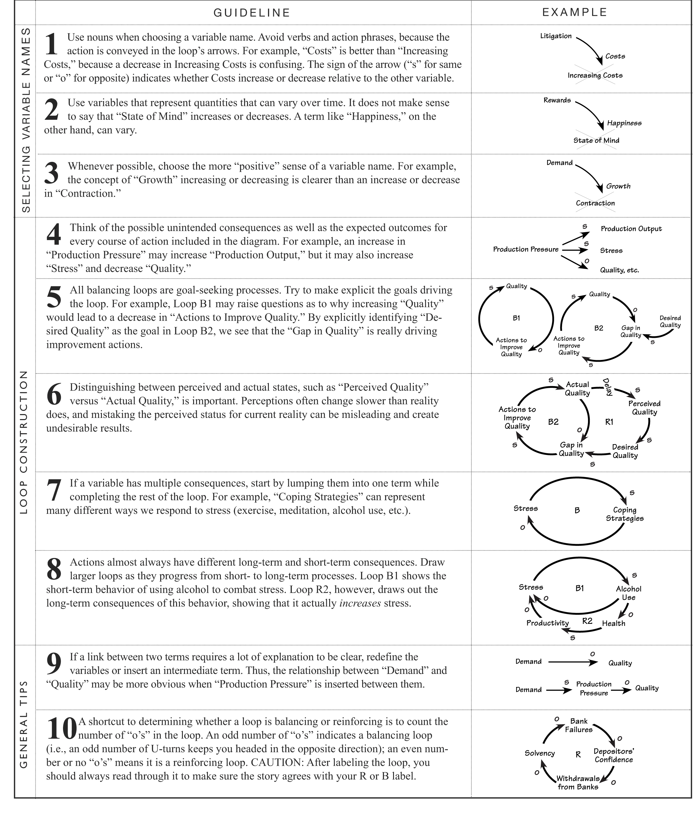
Following are some more general guidelines that should help lead you through the process:
- Theme selection. Creating causal loop diagrams is not an end unto itself, but part of a process of articulating and communicating deeper insights about complex issues. It is pointless to begin creating a causal loop diagram without having selected a theme or issue that you wish to understand better. “To understand the implications of changing from a technology-driven to a marketing-oriented strategy,” for example, is a better theme than “To better understand our strategic planning process.”
- Time horizon. It is also helpful to determine an appropriate time horizon for the issue—one long enough to see the dynamics play out. For a change in corporate strategy, the time horizon may span several years, while a change in advertising campaigns may be on the order of months.
Time itself should not be included as a causal agent, however. After a heavy rainfall, a river level steadily rises over time, but we would not attribute it to the passage of time. You need to identify what is actually driving the change. In computer chips, $/MIPS (million instructions per second) decreased in a straight line in the 1990s. It would be incorrect, however, to draw a causal connection between time and $/MIPS. Instead, increasing investments and learning curve effects were likely causal forces.
- Behavior over time charts. Identifying and drawing out the behavior over time of key variables is an important first step toward articulating the current understanding of the system. Drawing out future behavior means taking a risk—the risk of being wrong. The fact is, any projection of the future will be wrong, but by making it explicit, we can test our assumptions and uncover inconsistencies that may otherwise never get surfaced. For example, drawing projections of steady productivity growth while training dollars are shrinking raises the question, “If training is not driving our growth, what will?” The behavior over time diagram also points out key variables that should be included, such as Training Budget and Productivity. Your diagram should try to capture the structure that will produce the projected behavior.
- Boundary issue. How do you know when to stop adding to your diagram? If you don’t stay focused on the issue, you may quickly find yourself overwhelmed by the number of connections possible. Remember, you are not trying to draw out the whole system—only what is critical to the theme being addressed. When in doubt, ask, “If I were to double or halve this variable, would it have a significant effect on the issue I am mapping?” If not, it probably can be omitted.
- Level of aggregation. How detailed should the diagram be? Again, the level should be determined by the issue itself. The time horizon also can help determine how detailed the variables need to be. If the time horizon is on the order of weeks (fluctuations on the production line), variables that change slowly over a period of many years may be assumed to be constant (such as building new factories). As a rule of thumb, the variables should not describe specific events (a broken pump); they should represent patterns of behavior (pump breakdowns throughout the plant).
- Significant delays. Make sure to identify which (if any) links have significant delays relative to the rest of the diagram. Delays are important because they are often the source of imbalances that accumulate in the system. It may help to visualize pressures building up in the system by viewing the delay connection as a relief valve that either opens slowly as pressure builds or opens abruptly when the pressure hits a critical value. An example of this might be a delay between long work hours and burnout: After sustained periods of working 60+ hours per week, a sudden collapse might occur in the form of burnout.
See detailed guidelines for drawing causal loop diagrams.

