Distinguish Between Actual and Perceived Conditions
Perceptions and reality often differ, and it is usually important to capture these differences in your causal diagrams. The true state of affairs can be very different from the perception of that state by the actors in the system.
WHAT IS THE QUALITY OF OUR PRODUCTS?
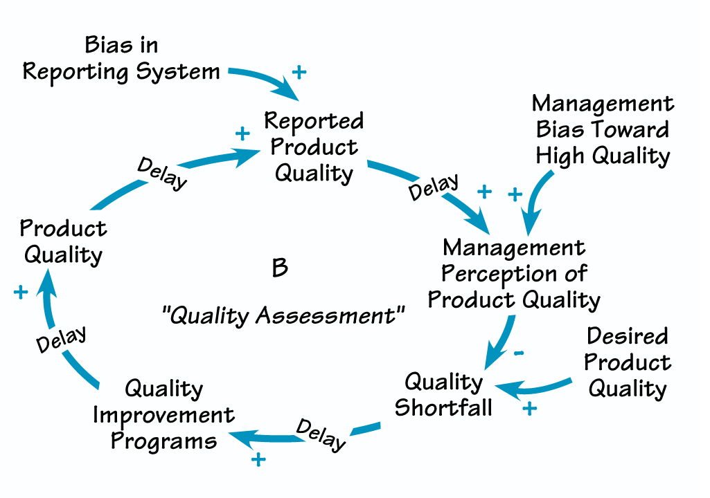
Distinguishing between actual and perceived conditions adds important information to a model for the management of product quality.
People’s perceptions can be influenced by reporting delays, measurement error, bias, or other distortions, causing people to make different decisions than they would if they had more accurate information.
For example, do the top managers of a firm know the true quality of their products? How do they respond if there is a quality shortfall? In drawing a CLD depicting this situation, separating perceived and actual conditions helps prompt questions such as, How long does it take to measure quality? To change management’s opinion about quality even after data are available? To implement a quality improvement program? To realize results? You might discover that there are significant delays in assessing product quality and in changing management’s opinion about quality (see “What Is the Quality of Our Products?”).
In addition, bias in the reporting system may cause reported quality to differ from quality as experienced by the customer. Customers don’t file warranty claims for all problems or report all defects to their sales representatives. Sales and repair personnel may not report all customer complaints to the home office. Sub ordinates, wishing to avoid delivering bad news, may filter the quality assessment in formation that reaches senior management. The diagram shows these biases, helping to explain how management might come to hold a grossly exaggerated view of product quality. Such a model can serve as the basis for conversation about ways to shorten the delays, overcome the biases, and avoid quality erosion.
'+' AND '–' VS. 'S' AND 'O'
Don’t Forget Delays
Delays are critical in creating dynamics. Delays give systems inertia, can cause oscillations, and are often responsible for trade-offs between the short- and long-run effects of our policies. Your CLDs should include delays that are important to the dynamics you are trying to represent or are significant relative to the time horizon relevant to your issue.
For example, when the price of a product rises, supply will tend to increase, but only after significant delays while new capacity is ordered and built and while new businesses enter the market. It’s therefore important to include these delays (by writing the word “delay” or drawing hash marks over the relevant link) because they will affect the system’s behavior over time. Remember that there are both physical, or material, delays, such as the delay between ordering and receiving materials, and information, or perceptual, delays, such as the time required to report sales data, revise forecasts, and make decisions. Both types of delays should be represented in your causal maps.
It’s also useful to remember that delays always involve stock and flow structures. This is why it is doubly important to include delays in your diagrams—they will remind you that there is a stock and flow structure embedded in that particular relationship. You can then explore whether it is useful to make that structure explicit in your diagram. Make stock and flow structures explicit if doing so is important in communicating the basis for the dynamics your map seeks to explain.
Don’t Put All the Loops into One Large Diagram
Our short-term memory can hold from five to nine chunks of information at once. This limits the effective size and complexity of a causal map. Presenting a complex CLD all at once makes it hard to see the loops, understand which are important, or determine how they generate certain behaviors. Resist the temptation to put all the loops you or your client have identified into a single comprehensive diagram.
How then do you communicate the rich feedback structure of a system without oversimplifying? Build up your model in stages, with a series of smaller causal loop diagrams. Each diagram should correspond to one part of the story being told. These diagrams can have enough detail to show how the process actually operates. Then combine simpler versions of the diagrams into a high-level overview to show how they interact with one another. (For more details about ensuring the clarity of your diagrams, see “Tips for CLD Layout.”)
TIPS FOR CLD LAYOUT
To maximize the clarity and impact of your CLDs, follow some basic graphic design principles:
- Use curved lines.
- Draw important loops with circular or oval paths.
- Organize your diagrams to minimize crossed lines.
- Don’t put circles, hexagons, or other symbols around the variables. Symbols without meaning only serve to clutter and distract (the exception is when you need to make a stock and flow relationship explicit).
- Iterate. Because you often won’t know what all the variables and loops will be when you start, you will have to redraw your diagrams, often many times, to find the best layout.
Check to make sure your audience is following the logic of the causal links. If they are not able to follow the thinking without assistance, you may need to include more detail or make some of the intermediate variables more explicit. “Making Links Explicit” shows an example.
MAKING LINKS EXPLICIT
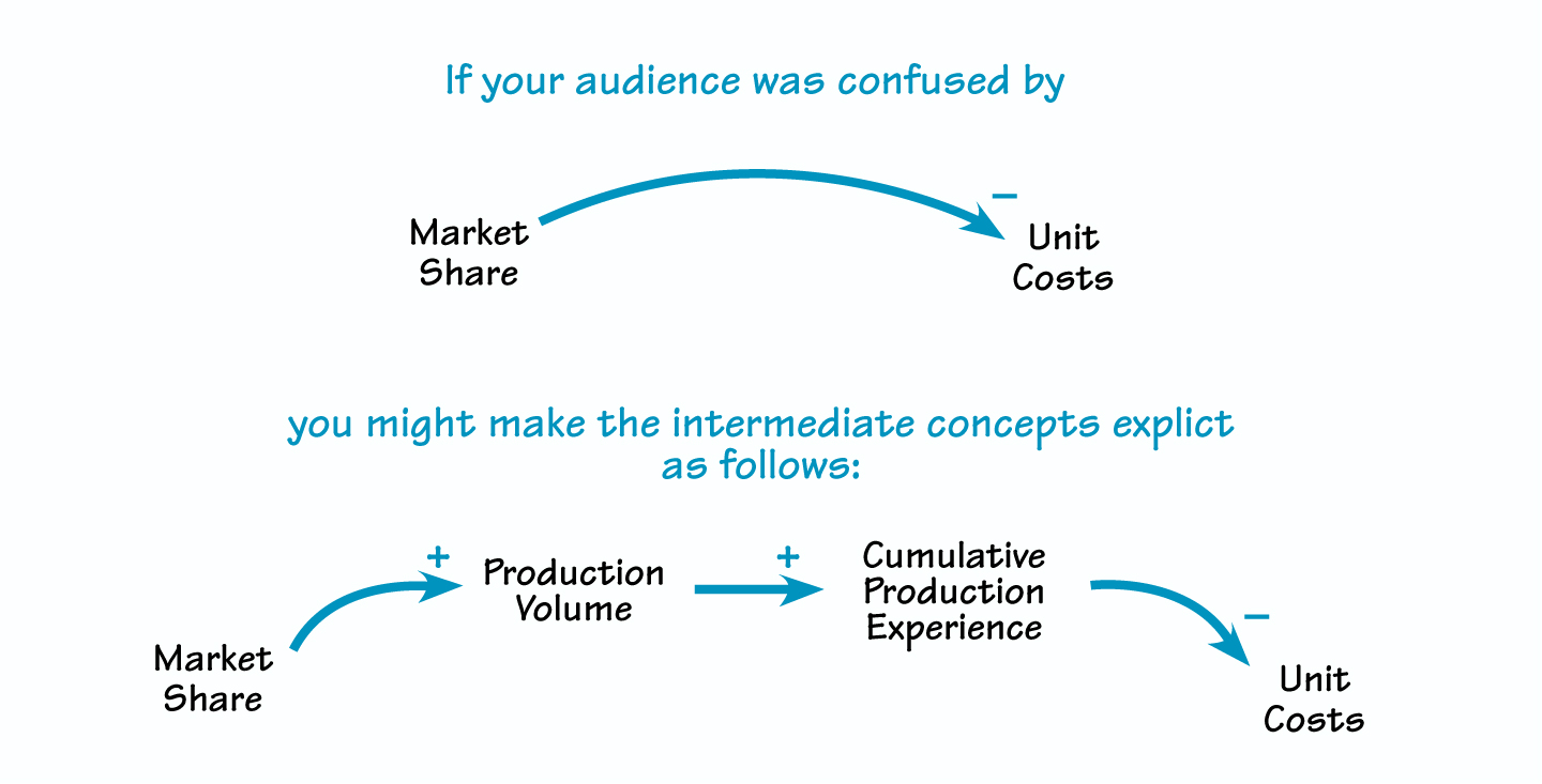
Make intermediate links explicit to clarify a causal relationship.
Once you’ve clarified the logic to the satisfaction of all, you often can “chunk” the more detailed representation into a simpler, more aggregate form. The simpler diagram then serves as shorthand for the richer, underlying causal structure.
Name Your Loops
Whether you use CLDs to elicit clients’ mental models or to communicate the important feedback processes that you believe are responsible for a problem, you will often find yourself trying to keep track of more loops than you can handle. Your diagrams can easily overwhelm the people you are trying to reach. To help your audience navigate the network of loops, give each a number and a name. Numbering the loops R1, R2, B1, B2, and so on helps your audience find each loop as you discuss it. Naming the loops helps your audience understand the function of each loop and provides useful shorthand for discussion.
When working with a client group, it’s often possible to get them to name their own loops. Many times, they will suggest a whimsical phrase or some organization-specific jargon for each loop. For instance, if you have a loop that depicts how working too much overtime might eventually undermine productivity, the group might label it “Burnout.” They might call a loop that shows how schedule pressure can lead to increased errors “Haste Makes Waste.” Loop names make it easy to refer to complex chunks of feedback structure, leading to productive conversations and, ultimately, changes in deeply ingrained behavior.
John D. Sterman is the J. Spencer Standish Professor of Management at the Sloan School of Management of the Massachusetts Institute of Technology and director of MIT’s System Dynamics Group.
This article is part of a 2-part series. Click here to view the first part.